In our first installment of this Making of the Tour series we gave a general overview of our development process and our scrollytelling code structure. Now we get to dig into some details. In this post, we’ll talk about some simulation-powered animations, provide some cleaned-up code that you can use, and discuss these animations’ genesis and utility for visualizing abstract systems and algorithms or for visualizing real historical data and projected futures.
Simulations in JavaScript?1
Each of the animations described in this post are powered by randomized simulations, coded in JavaScript and running behind the scenes in the browser. If you refresh the Tour or watch two screens at once you’ll see different behavior. However, they are generally structured in a way that would also allow them to use historical data or simulation results that are streaming from a server, since in most cases that was their original design spec.
We’ll walk through each of the four independently below, but take this chance to first highlight their shared structure:
configure visualization

d3.timer or d3.interval loop {

    periodically read or simulate new data

    d3 enter-update-exit pattern to animate svg

}
State Transitions
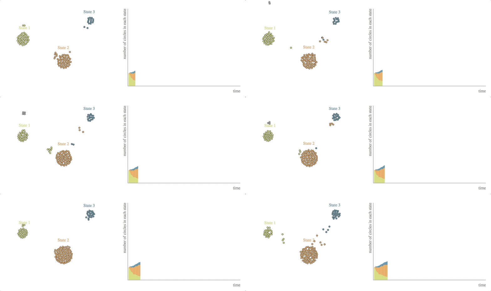
code: block, github gist
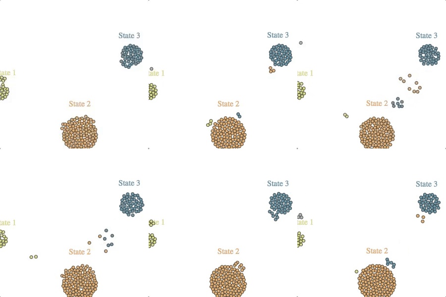
Underlying this state transitions animation is a discrete-time simulation, where (a) entities are being added to the system with some probability (as a function of time) and (b) they are moving between states based on a transition probabilities matrix.
The svg update occuring at each timestep is twofold. Another stacked bar is added to the graph on the right according to how many entities are in each state at that time. Then there’s the more fun part on the left, which–as it happens–is just a multi-foci force layout. At each simulation timestep we simply need to modify each circle’s associated focus and let the force layout do the rest.
We anticipate that state transition animations like this could have lots of potential data visualization applications: client states over time, international migration, etc.
Latent Size Learning
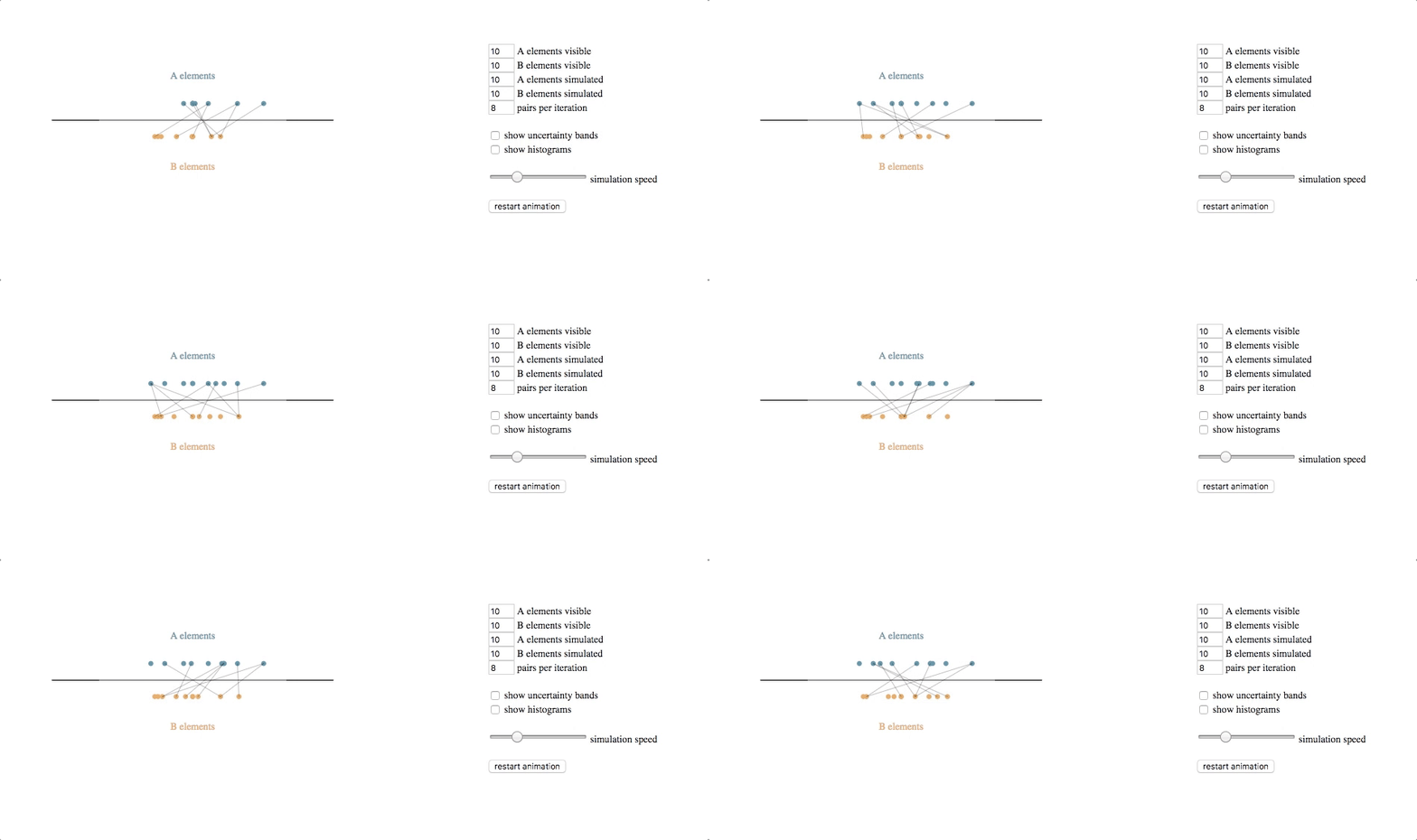
code with extras (control panel, uncertainty bands, histograms): block, github gist
bare-bones code: block, github gist
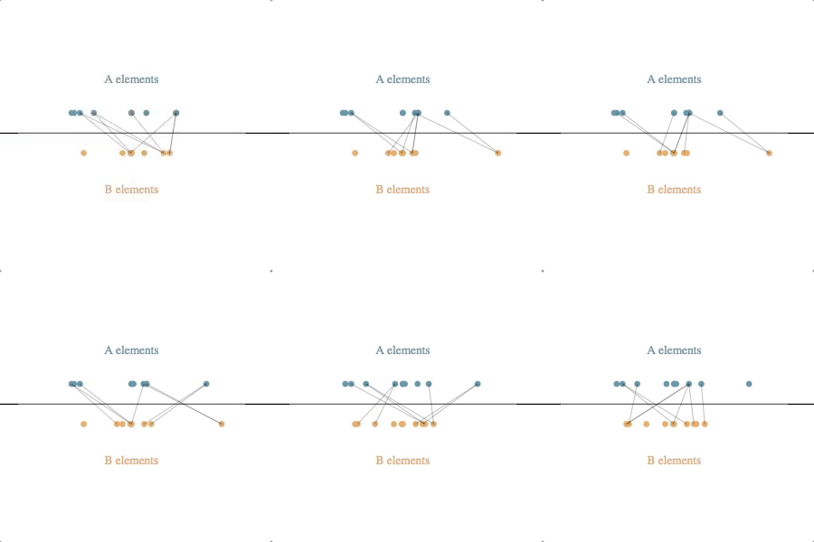
The underlying simulation here requires a bit of explanation. Each circle (e.g. each client or clothing style) is assumed to have some latent value along the horizontal axis–some true value for an attribute that we cannot observe directly but that we can try to estimate based on feedback. Note that we don’t know the latent values for either the A elements or the B elements, and the feedback we get is from attempted pair-matches involving one of each type.
Our simulated algorithm is fairly simple:
- assign each entity a current estimated latent value, initialized at the center of the scale
- select A-B pairs randomly, weighted by the distance between their current estimated latent value (shorter distances produce higher probabilities of selection)
- if the feedback from the pair attempt says their relative latent values are different than what our estimates suggest, move both of the current estimated latent values in the direction of feedback (e.g. if A says B is too small, then move A to the right and B to the left), multiplied by a learning rate
- repeat
The underlying simulation, then, is running this algorithm over a set of entities while also simulating the entities, each of which has its own latent value and the feedback it provides when paired with other entities is based on the actual differences between their latent values, with some noise added for good measure.
The svg update is straightforward: at each timestep, pairs are shown by lines between the circles, and the circles are transitioned to their new location based on their current estimated latent value.
(You may notice that the code with extras version uses recursive d3.timeout calls instead of d3.interval. This is simply to allow the timestep to vary with the speed slider. In general, that code is somewhat longer than desired for an illustrative example since we opted to include the uncertainty bands, histograms and control panel. So we’ve also provided a simpler bare-bones version where it is easier to see the simulation / animation structure.)
We’ll admit that this animation was never really intended for serious internal use, but only to help explain the ideas of latent variables and how one might imagine getting at them. As we note in the Tour text, our treatment of fit is more complex than we show here, but we do think that this 1D visualization does effectively highlight some of the the essential ideas of latent size. Presumably it may also apply to various other two-sided marketplace pairing analyses.
Inventory Stock Management
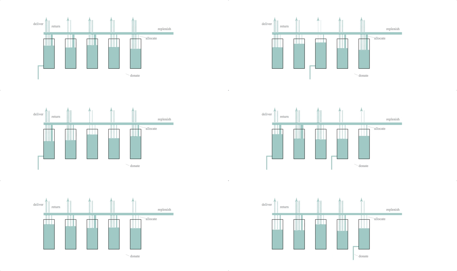
code: block, github gist
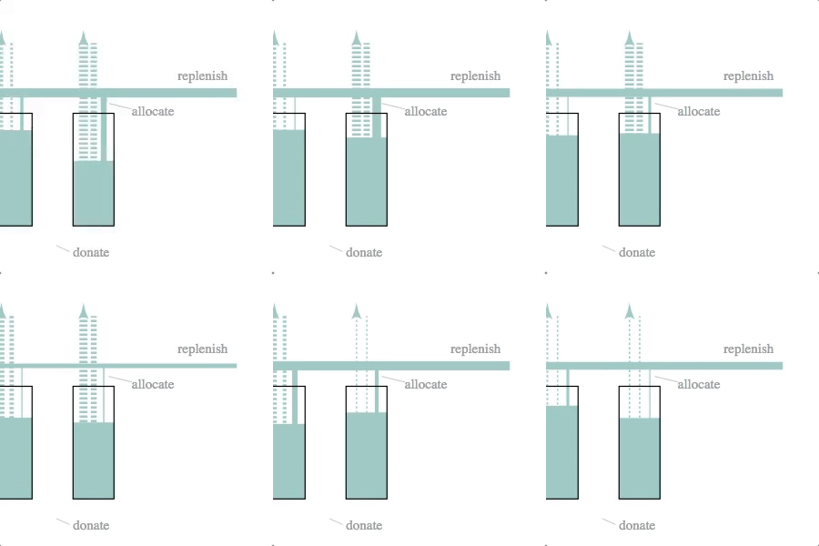
Mechanical engineers, eat your heart out. The underlying simulation here is that of a dynamic system model–essentially a set of difference equations with random disturbances–and a fairly crude control logic. The simulation and svg update is part of a d3.timer function, making it more like a continuous simulation than the previous two cases (which were both discrete simulations with relatively long timestep lengths).
The svg update is dead simple: the widths of the lines and the heights of the rectangles are set to the current volumes and flow rates calculated by the simulation.
We like this simulation / animation as an example of the Illustrator-D3 methods we talked about in the previous installment of this series: sketch something, make it into an svg and then attach (simulation) data to particular attributes of the sketched objects.
Inventory Cycle
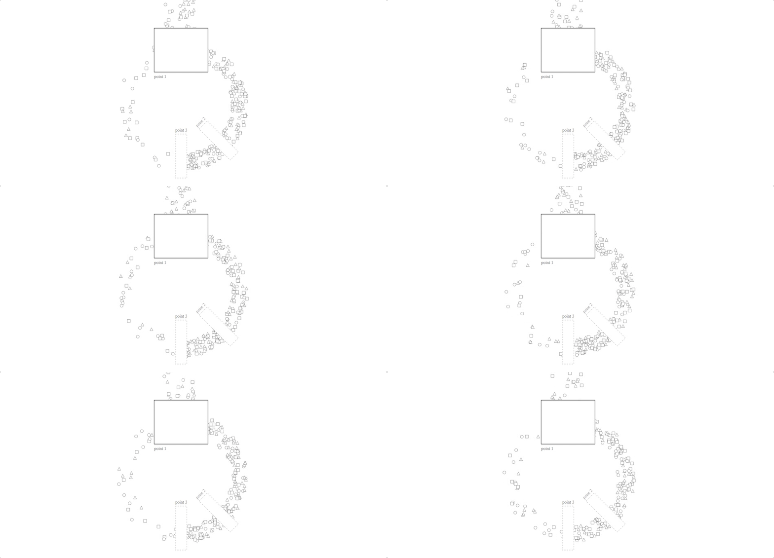
code with javascript simulation: block, github gist
code with external data: block, github gist
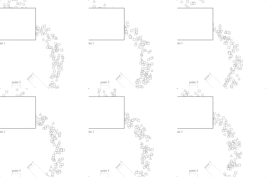
Although this animation looks nice as a randomized simulation, its utility is much greater for visualizing historical data. (The other three, by contrast, can say some interesting things about system dynamics, algorithms and control strategies without necessarily using real data.) Using real data about a process flow, you can watch various patterns emerge: bottlenecks, turbulence, eddies, etc. It is also meant for use with many more checkpoints than the two in our Tour and the three in this example. If returns aren’t as important in your application as they are for Stitch Fix, you can consider using a line instead of a circle (though the circle does look nicer!).
In both versions of the code linked above, the “simulation” part of the code is keeping track of each unit’s previous event, its next event and its temporal position between the two (either by simulating it in situ or by reading those values from elsewhere). The svg update is then mapping from that position-between-events to a point on the screen.
Comparing these two versions of the code–one with a javascript simulation, the other using an external data file–demonstrates how you can fairly easily move between the two use cases while keeping with the same general pattern. With just a bit of wrangling, the same sort of change could be applied to any of the animations above. And you could similarly apply this pattern, in either of these two modes, to plenty of other kinds of system simulation / animation that you might sketch onto a napkin.
More in Store
In our next post, we’ll talk about some of the finer points. Stay tuned!
1 Wouldn’t be the first time we’ve engaged in such shenanigans. ←
